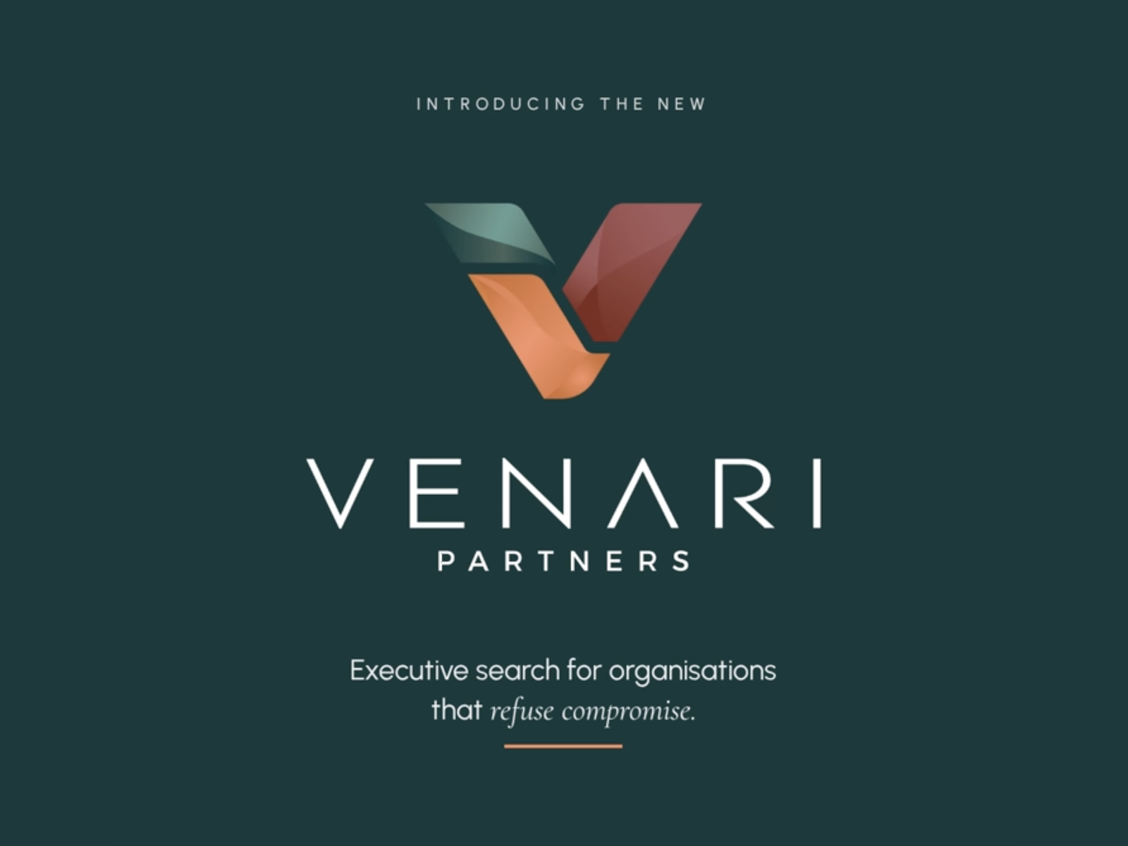
Venari Partners, an executive search firm, asked us for a new brand. Before we drew anything, we ran discovery workshops with Venari's management, staff, clients and candidates. The strategy that came out of them set the colours, the graphic language and the order of the website. It also made us drop the direction we had started with. This piece covers the brand. The main Venari case study covers the whole project.
A search firm sells trust in its people. A logo can't show that on its own. We needed to hear what clients and candidates already valued Venari for before deciding how the brand should look.
The workshops gave us four things to build on:
The original brief explored a supportive "guide" persona for the brand. On paper it suited a firm built on long relationships. In the workshops, the team described themselves as proactive and relentless. A guide would have felt false to them. We dropped it and built the brand around the hunter instead.
The strategy started from Venari's own mantra, "Pace with Detail": move quickly without losing depth or accuracy. The strategy made Pace, Detail and Care the brand's core values, with Care standing for the personal attention Venari already gives clients and candidates. We then studied three corners of the executive search market: a modern challenger, the large established firms and a premium boutique.
Venari already had an orange that people recognised. The strategy kept it but changed its job. Instead of leading, it became the accent, Ember Orange, against a darker, heavier palette of Obsidian Green and Oxblood, with Slate Green and Rosewood in support. The dark colours give the weight a board expects. The orange keeps the energy of a firm that moves faster than its larger rivals.
The mark took three rounds of logo concepts before we settled on the V built from three folded planes.
Graphic language. The strategy asked for sharp, forward-moving shapes in place of soft, rounded ones.
The website order. Most firms' sites run services, then about, then contact. The strategy turned that round: people first, then their stories, then the services.
The Challenge. It recommended treating the Venari Partners Challenge as part of the brand rather than a corporate responsibility page. The Challenge now has its own page on the site.
We delivered the guidelines in September 2026. They open with the strategy and ethos. Then come tone of voice, the logo and its usage rules, typography and colour. The last sections cover print mockups, photography and how the brand works on the website.
The strategy comes first so that a designer briefed later knows why the orange is an accent. A consultant writing a pitch deck knows which words the brand uses. The tone of voice section keeps to a few rules: short sentences, active voice, no jargon.
“They understood us as people before touching the architecture, delivering a brand and digital platform that perfectly captures who we are.”
Natasha Pabari, Head of Marketing, Venari Partners
Keep the first direction loose until the people in the room have spoken. Keeping the guide persona would have given Venari a brand its own team didn't recognise.
If you are planning a rebrand for a professional services firm, our Brand Architecture page explains how we work, or you can email studio@mouriaux.com.
Written by Tom Le Mesurier, Principal, Mouriaux.